HMI · Design System · Automotive

Scaling In-Car UX
Across Every Screen.

How a small team of UX designers pioneered a variable-index system to deliver three core automotive apps across four different screen sizes — systematically, efficiently, and at scale.

Role
UX Designer
& System Architect
Scope
Media · Navigation
Voice Assistant
Constraints
4 screen sizes
Multiple car models
Outcome
Successfully implemented
Significant time savings
01 — Problem

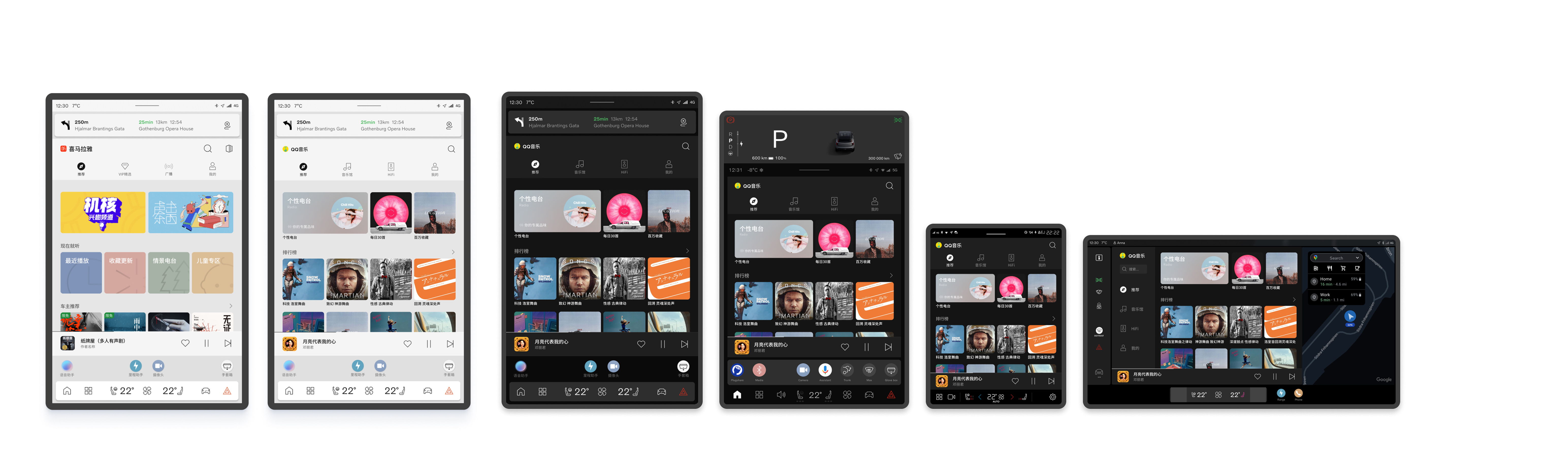
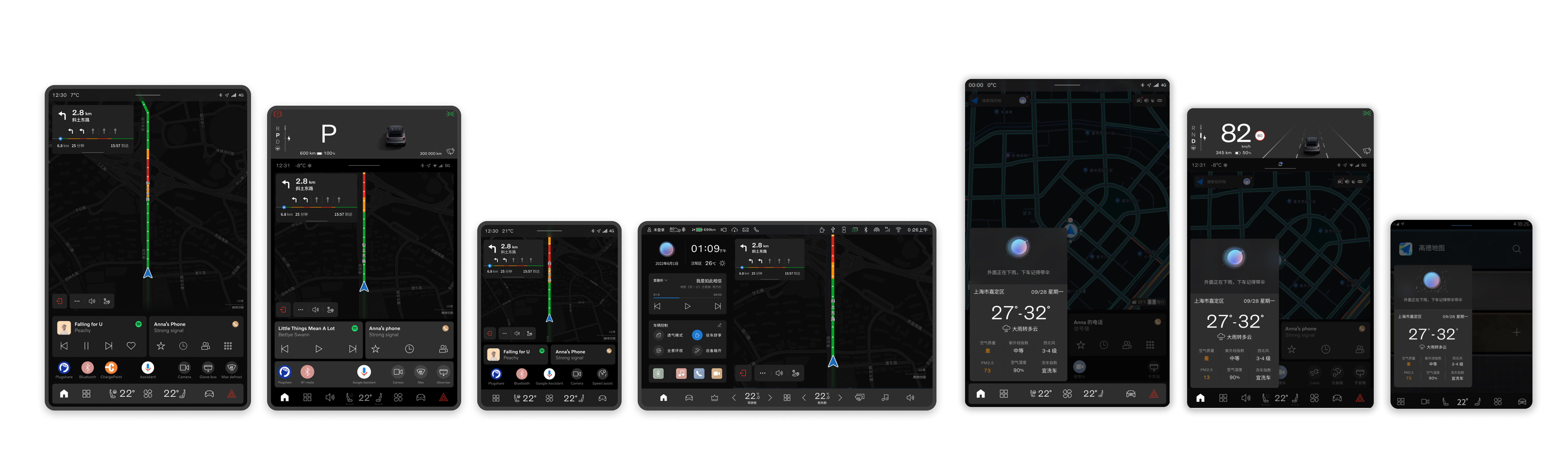
Three apps. Four screens. No system.

The team needed to ship three core HMI applications — a media player, a navigation system, and a voice assistant — across multiple car models, each with a different screen size and aspect ratio. With four distinct screen configurations to support, the traditional approach of designing each layout individually would have been time-consuming, inconsistent, and nearly impossible to maintain.

Without a systematic approach, designers and engineers would face constant rework. Each new car model would mean a full redesign cycle. The cost in time and quality risk was significant.

Applications
Media Player
Navigation
Voice Assistant
Screen Configurations
4 different sizes and aspect ratios across multiple vehicle models
Core Challenge
Layout logic that scales without manual redesign for each variant
Tool Context
Figma variables were not yet available when the system was first designed
02 — Approach

Pioneering a solution before the tools existed.

When we started, Figma had not yet released its Variables feature. We couldn't wait for tooling to catch up — the product timeline demanded a solution now. So we pioneered our own: a variable index system that defined UI widgets abstractly, decoupled from any specific screen size.

"Instead of designing for a screen, we designed for a rule. The screen was just an output."

Each widget — a media card, a map tile, a voice prompt panel — was defined by a set of indexed variables: its proportional size, spacing ratios, typographic scale, and layout priority. These indices could then be resolved against any target screen configuration to produce the correct rendered output automatically.

When Figma launched its native Variables feature, we migrated the system directly into Figma — validating our approach and making it even more accessible for the broader design and engineering team to work with.

03 — Process

From abstract rules to production-ready layouts.

🖼 Variable index diagram — add your image here
🖼 Figma Variables implementation — add your image here
04 — Outcome

Shipped. Scaled. Saved time.

The system was successfully implemented across all target vehicle models. What previously would have required separate design and engineering efforts for each screen configuration was now handled systematically — designers specified intent once, and the system resolved it everywhere.

3×
Apps delivered through one unified system
4
Screen sizes covered without redesign
Significant reduction in design & engineering rework time

Beyond the immediate project, the system established a new way of thinking about responsive HMI design within the team — treating screen size as a variable to be resolved, not a canvas to be designed for from scratch.

The approach was later further accelerated when Figma's own Variables feature launched, allowing us to validate and extend the system natively within our design tool of choice.

05 — Reflection

What I learned.

This project reinforced that strong design systems thinking isn't just about UI consistency — it's about reducing the surface area for error and rework across an entire product pipeline. The constraint of building without the right tooling forced us to think in first principles, which ultimately produced a more robust solution than if we'd simply reached for an existing tool.

Leading this work also taught me that pioneering a new approach requires as much communication as it does craft — bringing engineers, PMs, and fellow designers along on the logic was just as important as the system itself.